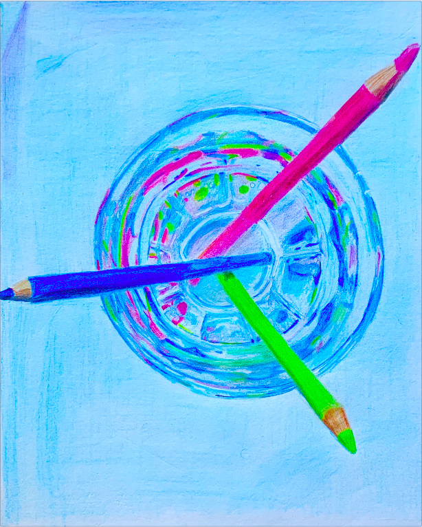
with brightness filter 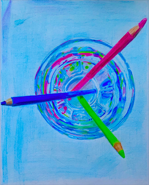
without brightness filter 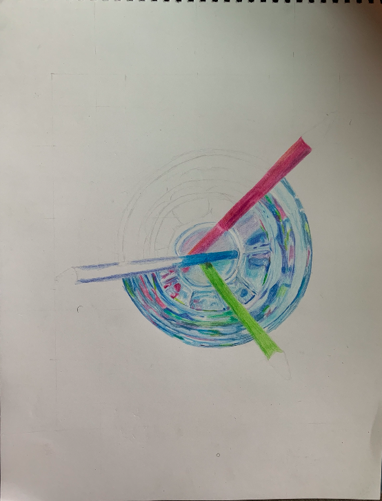
progress 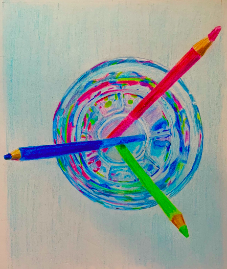
progress
The lighting when I take final photos are always dark/dull so in one of the above pictures I increased the brightness using the iphone picture settings. And I think it made it look closer to the original.
4 Comments
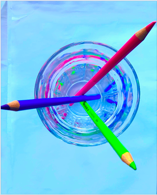
I think this drawing is turning out really cool! I love that you chose to do the top view of the pencils in the glass because it has made for a very compelling composition. I think you have also done a really great job with the glass as it appears to have all of these abstract shapes and forms created from the reflection of the pencils. The one thing I think the drawing needs is to be brighter and more colorful. In the photo, the saturation is very high and all of the different colors really stand out, so I think if you could go in and make yours brighter and more neon-looking that would help. Really good work!
The drawing is really progressing well. I agree with Katelyn that the color needs boosted a bit. Please re-photograph your work WITHOUT your shadow. That will help to really see the color. Perhaps tease apart the color difference in the table vs. the glass by making one more saturated/ intense and the other more pale.
You really did a great job with that glass!! The shapes are so nice, and the colors look so good. The more I look at this, the more I see! There is a lot of detail in this. I think turning up the brightness and saturation on the photo of the drawing would be interesting. It might be a better match to the original photo (and what you see in real life, since I know how different drawings can look in person versus online). Otherwise, I think this is looking great!
The attention to the way colors reflect and refract in the water and glass in this drawing is fantastic. It’s really cool and visually interesting to look at, and the subtle blending of the colors is very skillful. In comparison, the pencils look a little bit wonky, but it’s not much of an issue because of how great the rest of it looks.