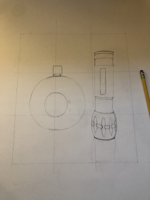
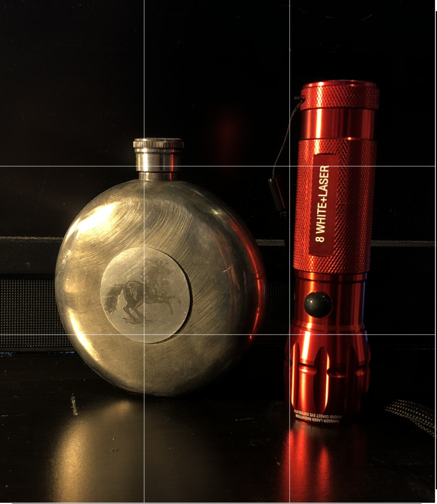
I think this is a cool take on the assignment by using reflective metal instead of a more translucent object like glass. One of the things that will make this drawing successful will be to include the reflection of the objects on the table surface and make sure that the objects pop out from the background- especially the red flashlight. Interested to see where this goes!
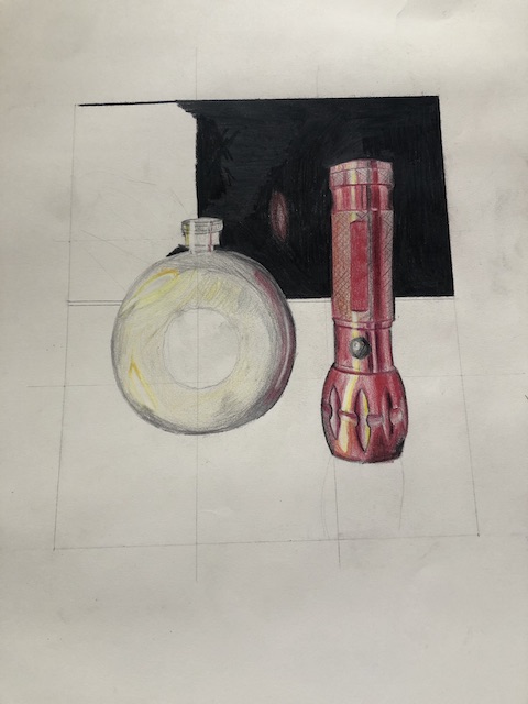
That flashlight is looking so good! You’ve really captured the detail in it, and looked really hard to find the different colors in what appears at first glance to be a single-color object. Really like the mark-making in the flask too!
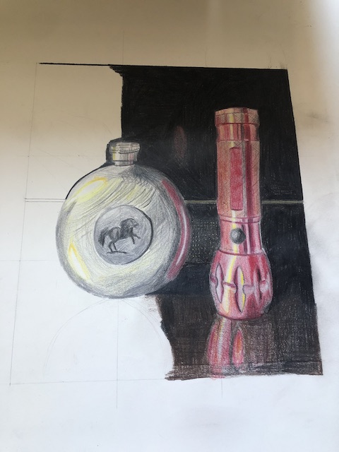
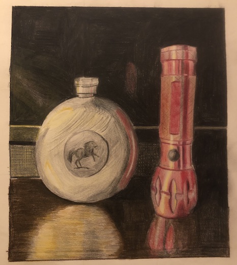
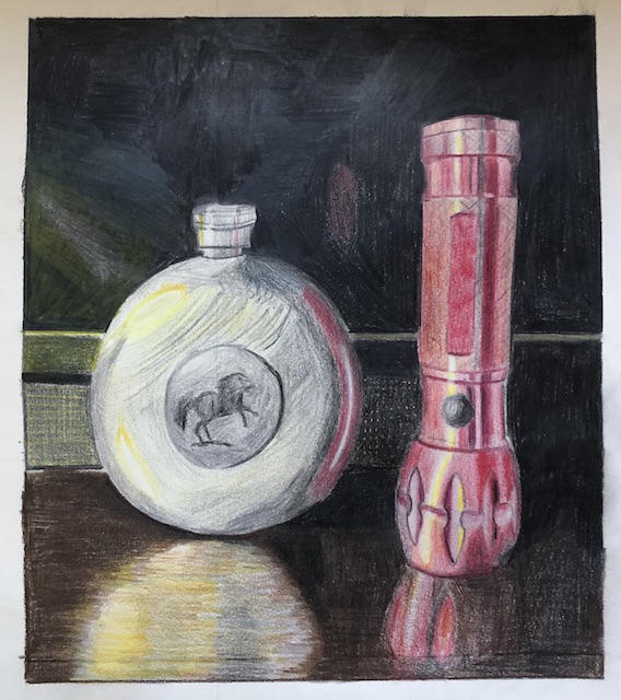
I like that you posted your final composition in two different light settings. I think the composition with warmer lighting works best. I think the flask could use a little bit more yellow/grey. I also think you did a fantastic job on the flashlight and your rendition of the horse. Great job!
The light reflecting off the flashlight looks excellent, both in the warm and natural lighting. The colors pop more in the warm lighting overall, but the natural lighting does a good job of bringing attention to the textures of the metal. The flask’s brushed metal texturing is an accurate and good touch, although perhaps a little more aggressive than on the actual flask.


6 Comments
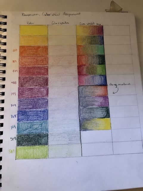
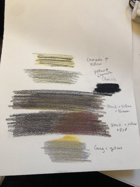
Wow-your color chart is fabulous. You can really see the origin of the color combinations. Can’t wait to see them working in your drawing.
I think this is a cool take on the assignment by using reflective metal instead of a more translucent object like glass. One of the things that will make this drawing successful will be to include the reflection of the objects on the table surface and make sure that the objects pop out from the background- especially the red flashlight. Interested to see where this goes!
That flashlight is looking so good! You’ve really captured the detail in it, and looked really hard to find the different colors in what appears at first glance to be a single-color object. Really like the mark-making in the flask too!
I like that you posted your final composition in two different light settings. I think the composition with warmer lighting works best. I think the flask could use a little bit more yellow/grey. I also think you did a fantastic job on the flashlight and your rendition of the horse. Great job!
I love how this turned out. You did an awesome capturing the light in the objects and in their reflections
The light reflecting off the flashlight looks excellent, both in the warm and natural lighting. The colors pop more in the warm lighting overall, but the natural lighting does a good job of bringing attention to the textures of the metal. The flask’s brushed metal texturing is an accurate and good touch, although perhaps a little more aggressive than on the actual flask.