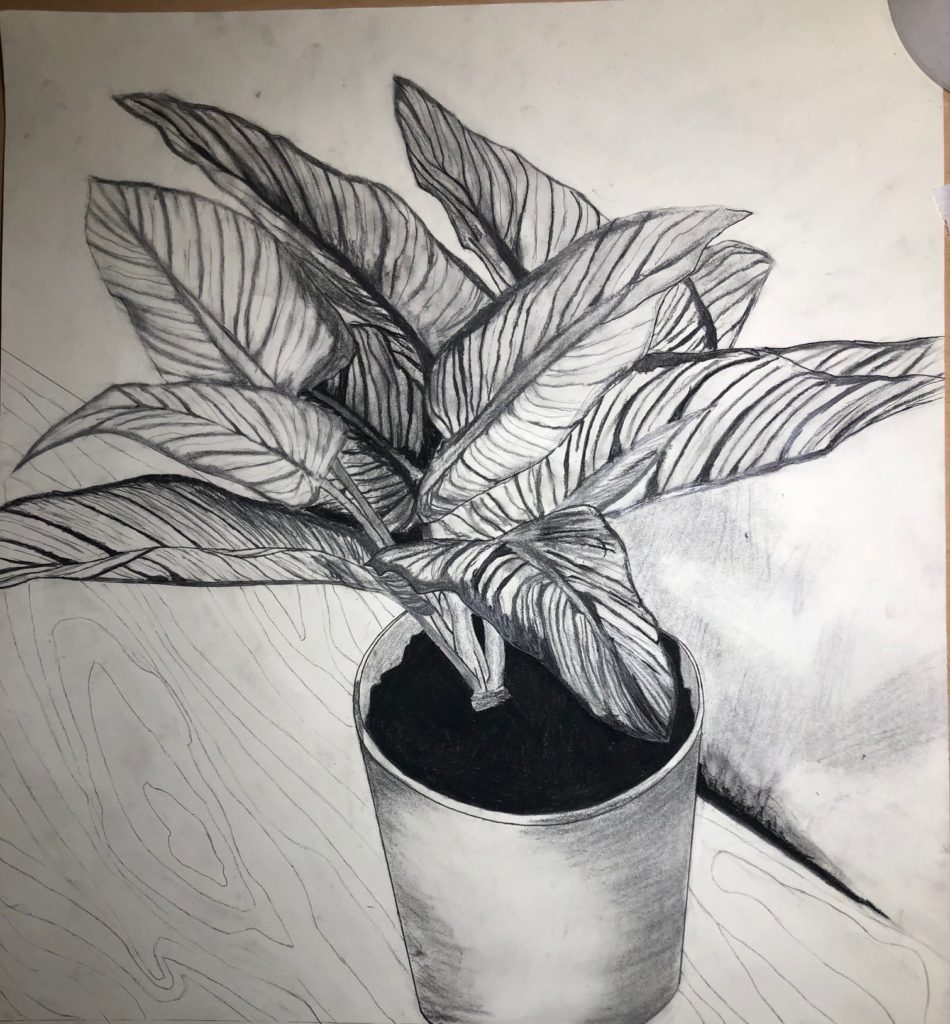
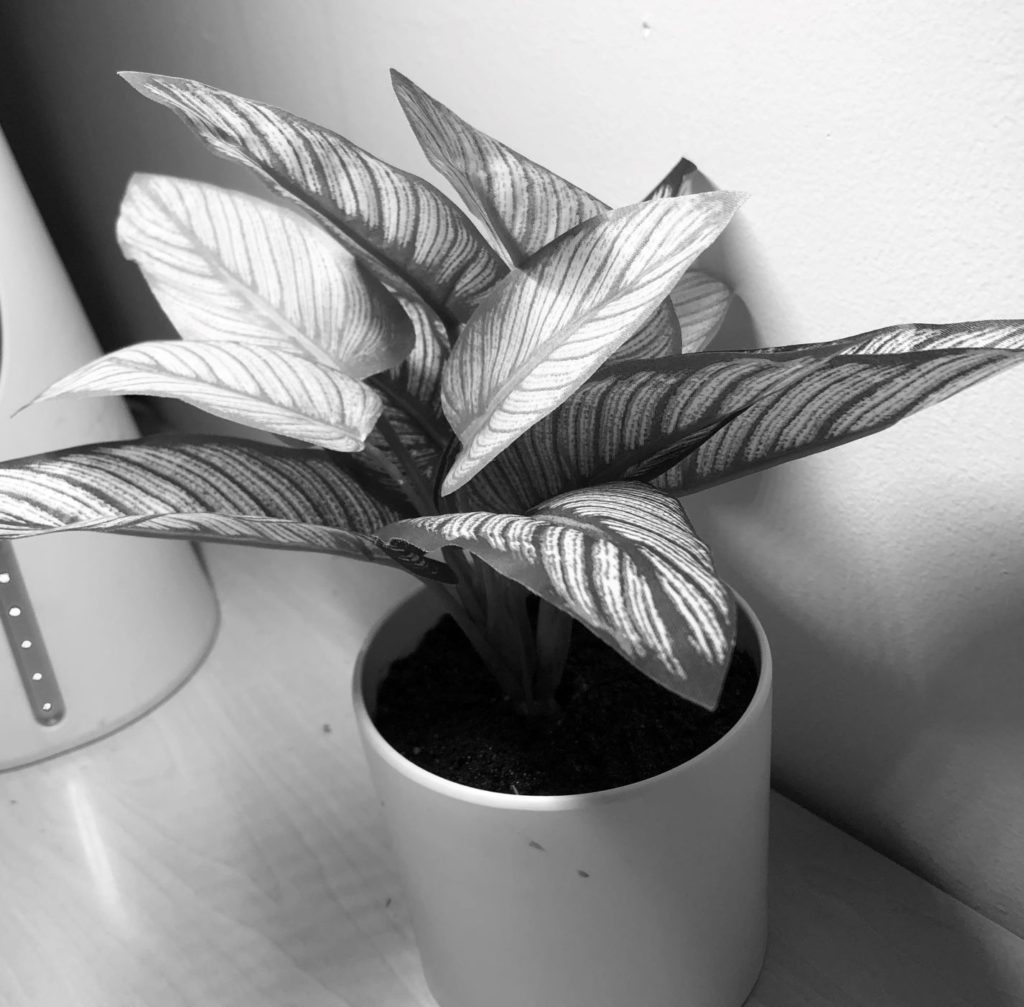
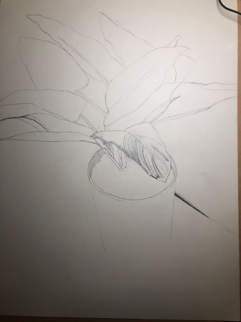
Amazing texture of the leaves- I love how graphic it is looking! I think if you want to keep it with a more graphic feel, I would fill in the dirt of the pot with your darkest black- that could look so cool! Wondering how you are going to tackle the white space surrounding the plant. I think adding the texture of the table/floor where it is sitting might be nice to ground the drawing. In that case you could leave the background of the wall white because there would be enough contrast.
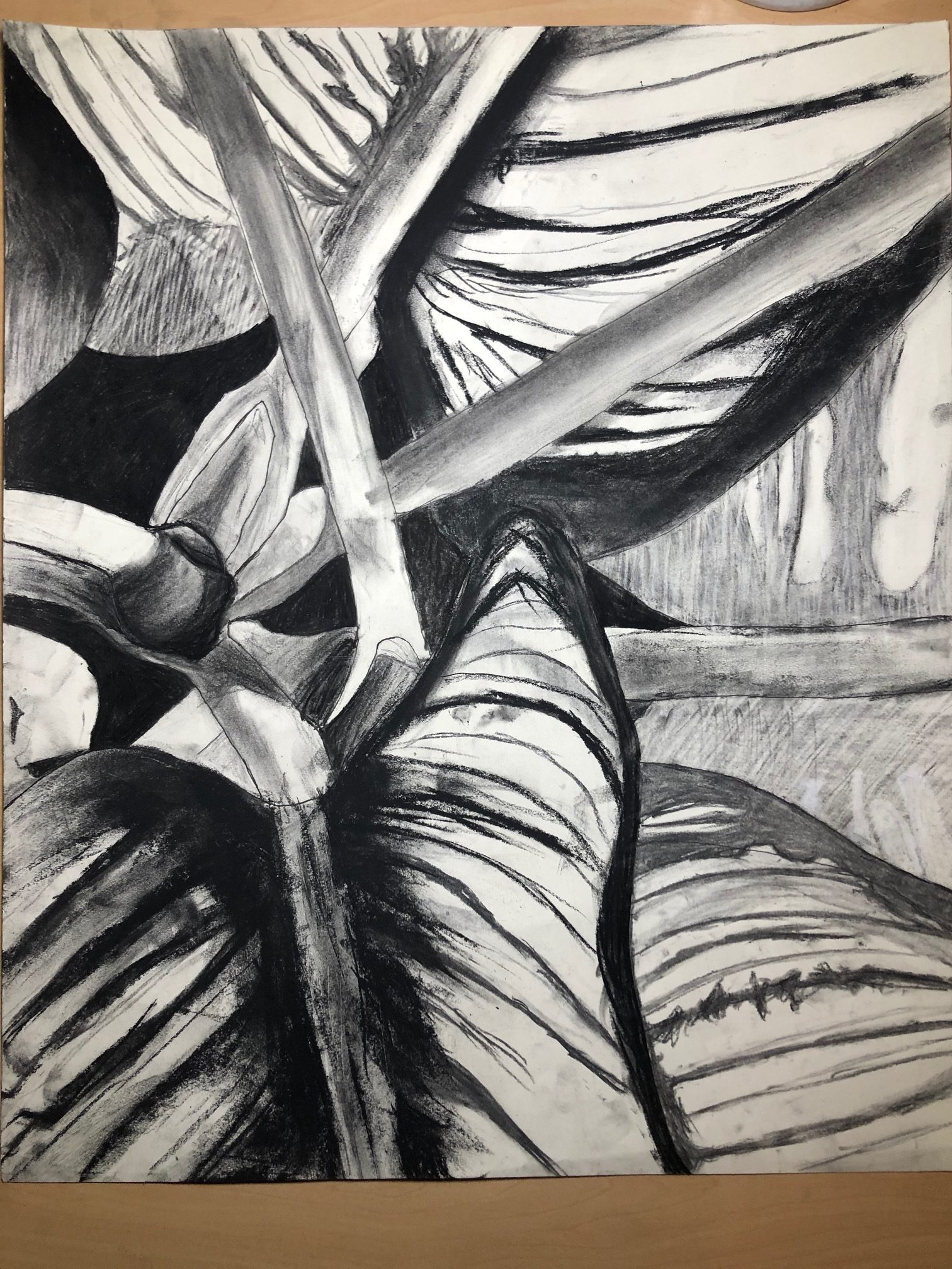
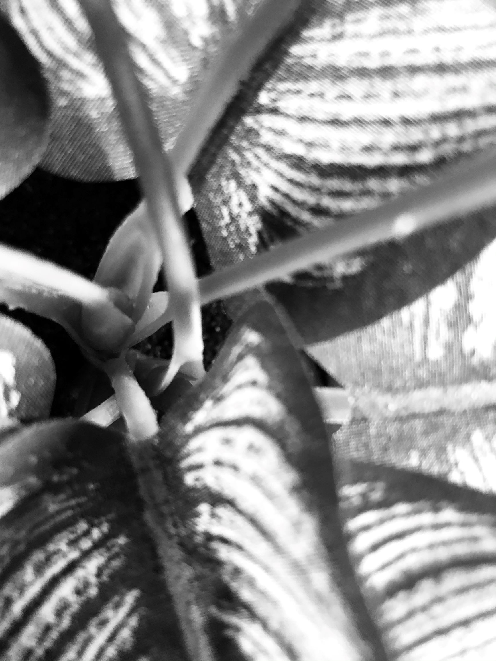
Excited to see what you decide for your macro drawing. I would encourage you to think about how to find a different kind of texture than you have already done in this drawing, possibly by zooming in hyper-close to the leaves until it becomes abstracted and unrecognizable as a leaf. Good luck and good job so far!
Beautiful job developing the wood grain of in the first drawing. I love how it has this graphic quality that I mentioned in an earlier comment- so cool. The leave texture is really so beautiful as well on both drawings. I love the image you chose for your macro drawing and I can see it developing so well.
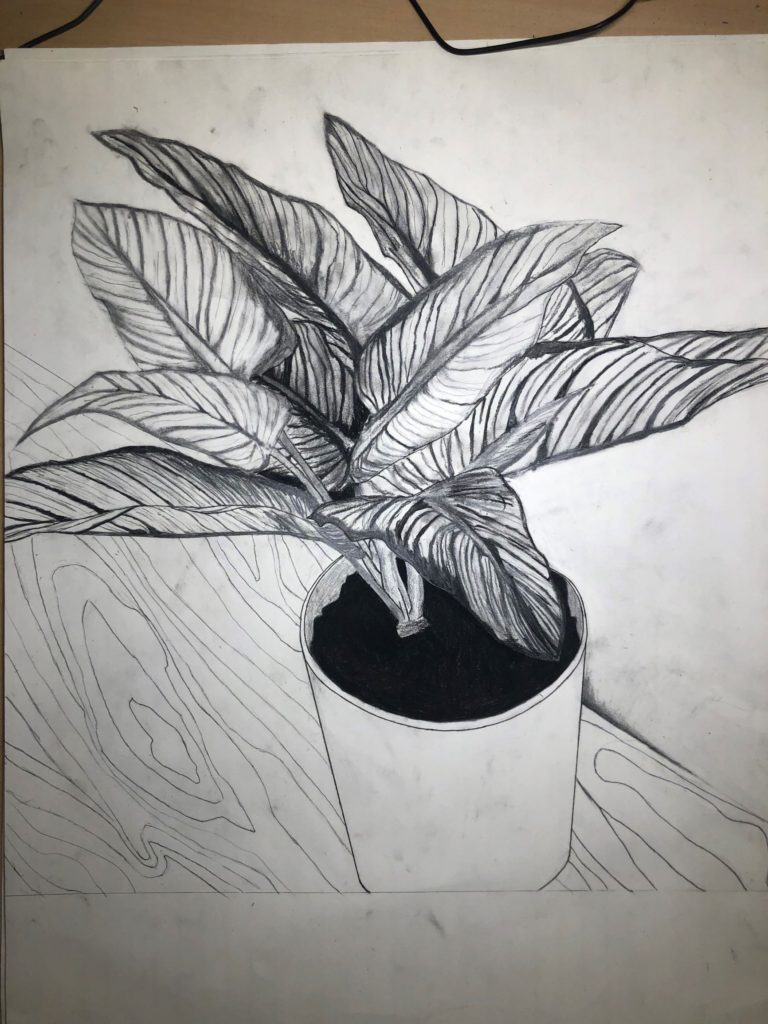
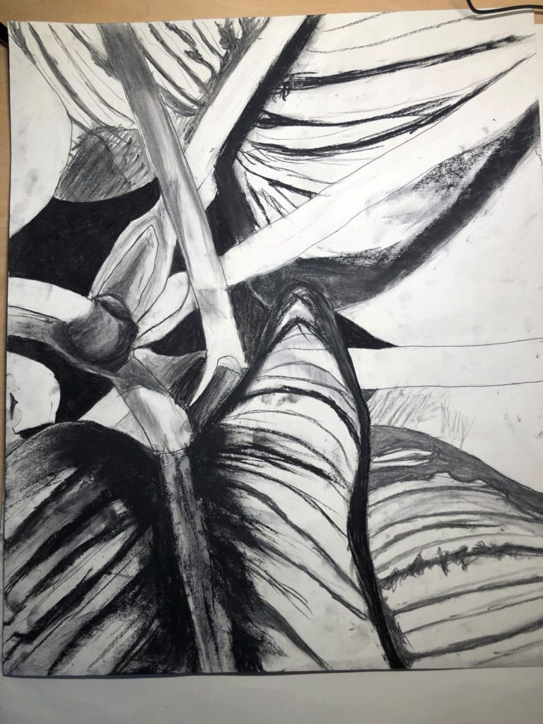
Really nice work. Can. you post the final image like Andreas (one photo of the final presentation) crop out areas , like the table, so we only see the art. Thanks
5 Comments
Amazing texture of the leaves- I love how graphic it is looking! I think if you want to keep it with a more graphic feel, I would fill in the dirt of the pot with your darkest black- that could look so cool! Wondering how you are going to tackle the white space surrounding the plant. I think adding the texture of the table/floor where it is sitting might be nice to ground the drawing. In that case you could leave the background of the wall white because there would be enough contrast.
Excited to see what you decide for your macro drawing. I would encourage you to think about how to find a different kind of texture than you have already done in this drawing, possibly by zooming in hyper-close to the leaves until it becomes abstracted and unrecognizable as a leaf. Good luck and good job so far!
looks good! those leaves are spectacular
Looking forward to seeing how you incorporate the class crit into your finished diptych. Strong progress thus far!
Beautiful job developing the wood grain of in the first drawing. I love how it has this graphic quality that I mentioned in an earlier comment- so cool. The leave texture is really so beautiful as well on both drawings. I love the image you chose for your macro drawing and I can see it developing so well.
Really nice work. Can. you post the final image like Andreas (one photo of the final presentation) crop out areas , like the table, so we only see the art. Thanks