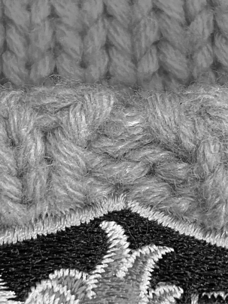
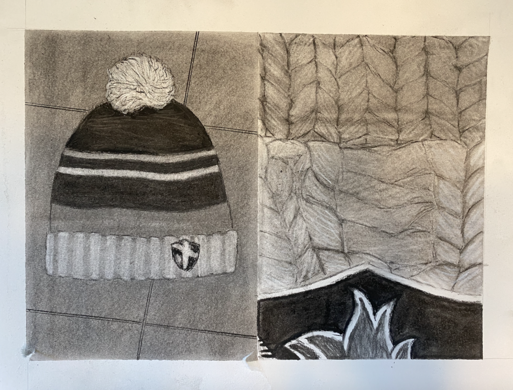
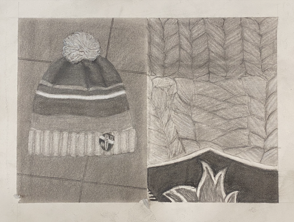
Really sensitive textured grays. The composition is great and I love how you can really feel the knit and pompom. As mentioned in the critique. I would just enhance the darks by one or two degrees to give more depth and volume and variety. Well done and solid growth!
I think you have done a really great job on your zoomed-out drawing with your treatment of the floor texture. By adding the grid lines of the floor tile, you have really helped to make the drawing more dynamic. I also think the use of white charcoal was really smart. As Deirdre said for the macro drawing, I would definitely go in and increase the contrast on the knit fabric. Nice work!
I like how warmly the floor textures on the left side blend together. I think they could stand to be a little lighter to help the hat pop out compositionally, however. There’s some nice attention to detail on the yarn patterns of the zoomed-in drawing as well. Good work!
3 Comments
Really sensitive textured grays. The composition is great and I love how you can really feel the knit and pompom. As mentioned in the critique. I would just enhance the darks by one or two degrees to give more depth and volume and variety. Well done and solid growth!
I think you have done a really great job on your zoomed-out drawing with your treatment of the floor texture. By adding the grid lines of the floor tile, you have really helped to make the drawing more dynamic. I also think the use of white charcoal was really smart. As Deirdre said for the macro drawing, I would definitely go in and increase the contrast on the knit fabric. Nice work!
I like how warmly the floor textures on the left side blend together. I think they could stand to be a little lighter to help the hat pop out compositionally, however. There’s some nice attention to detail on the yarn patterns of the zoomed-in drawing as well. Good work!